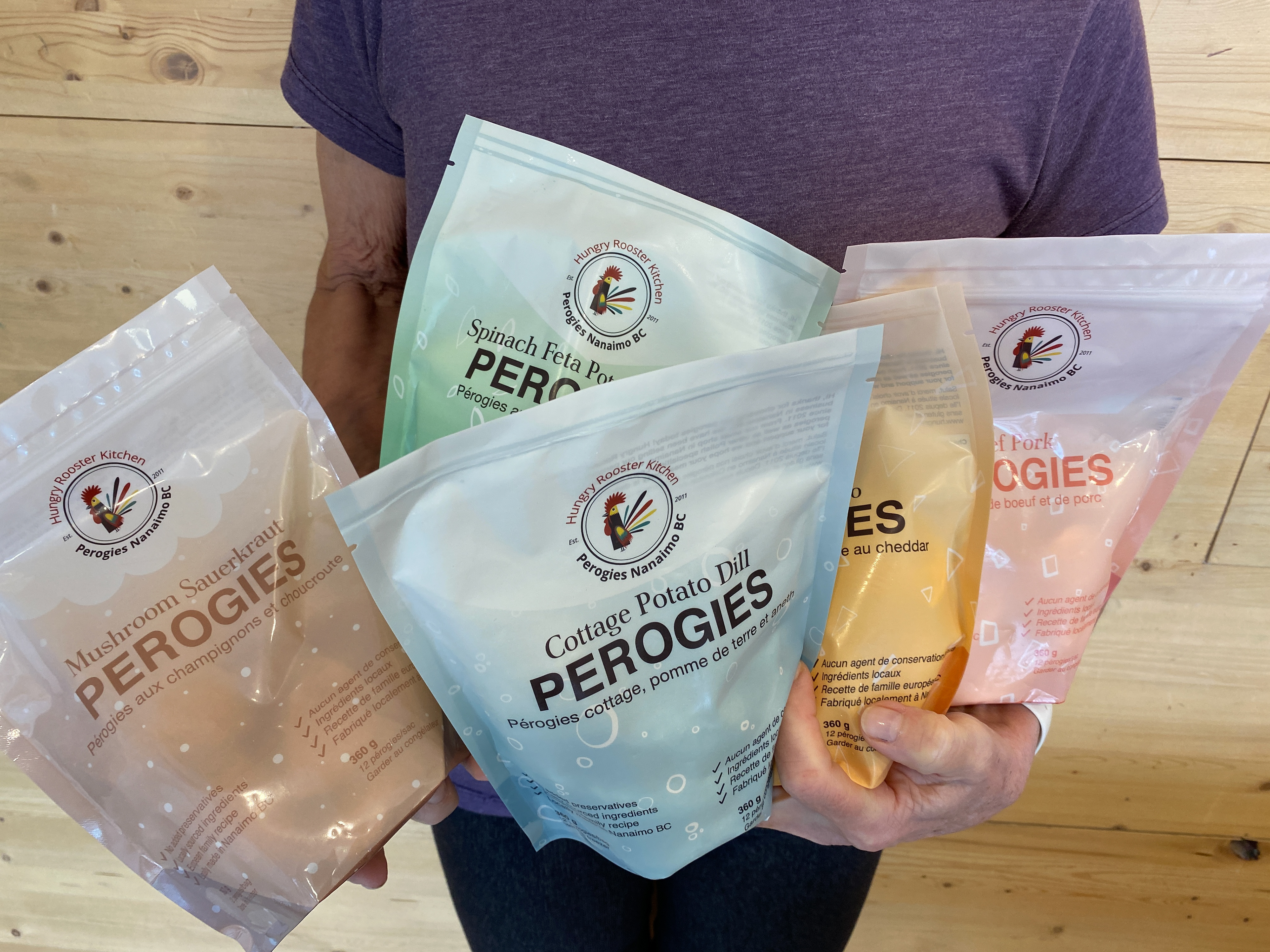
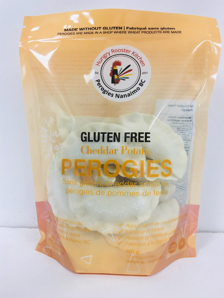
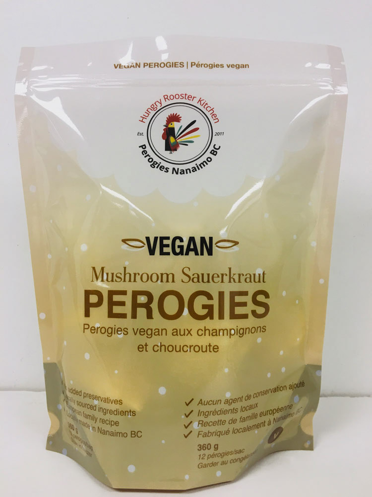
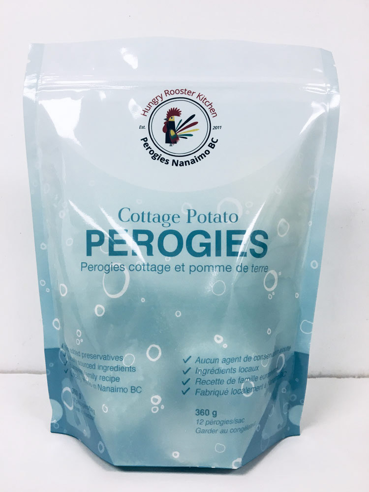
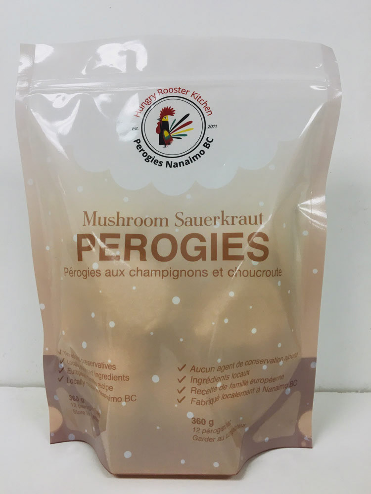
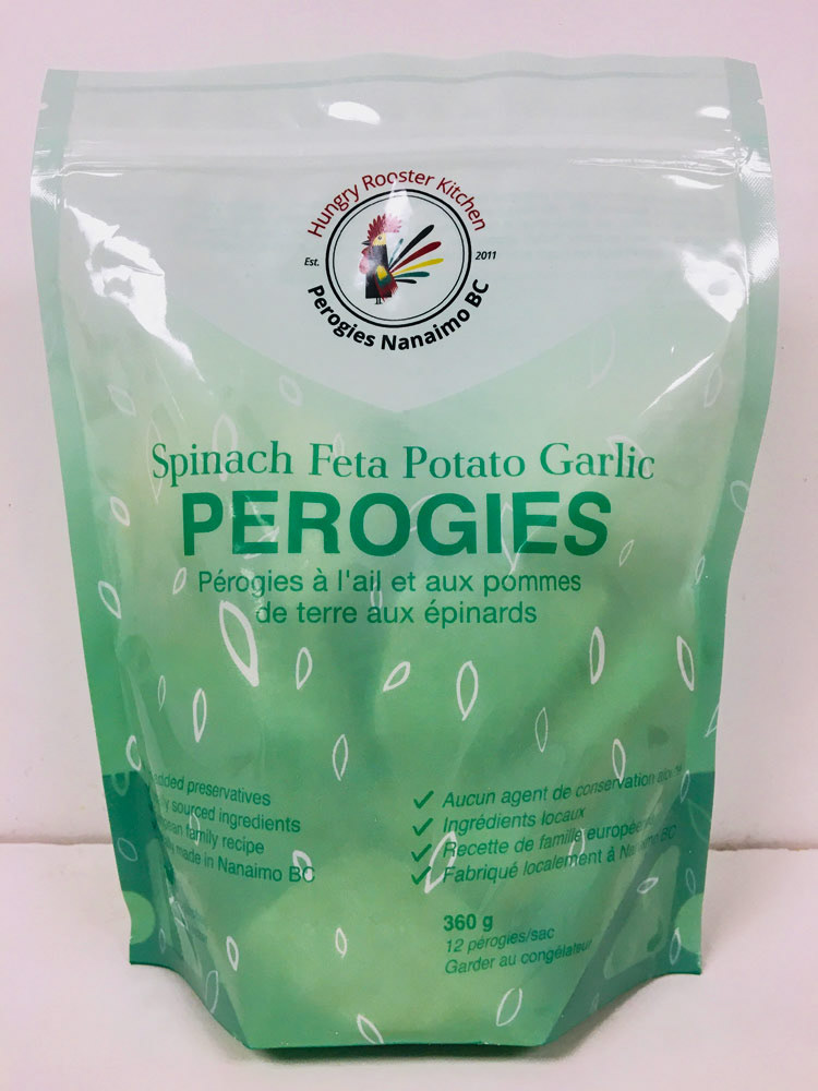
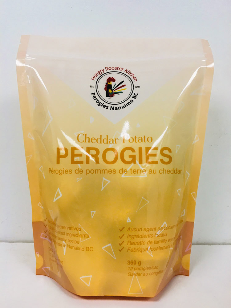
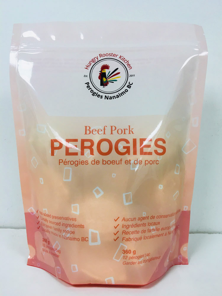
Hungry Rooster Kitchen
I was hired to do all the branding for Hungry Rooster Kitchen in Nanaimo BC.
Web design | Branding | Photography | Print design | Graphic design | Typography | Sign design |


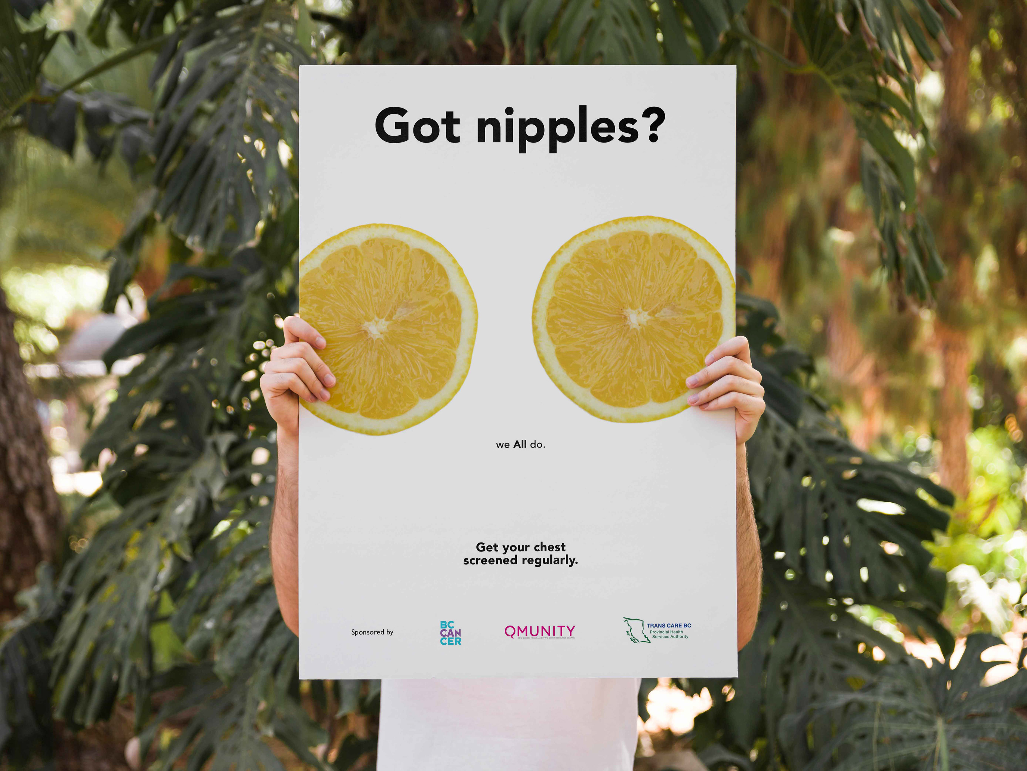
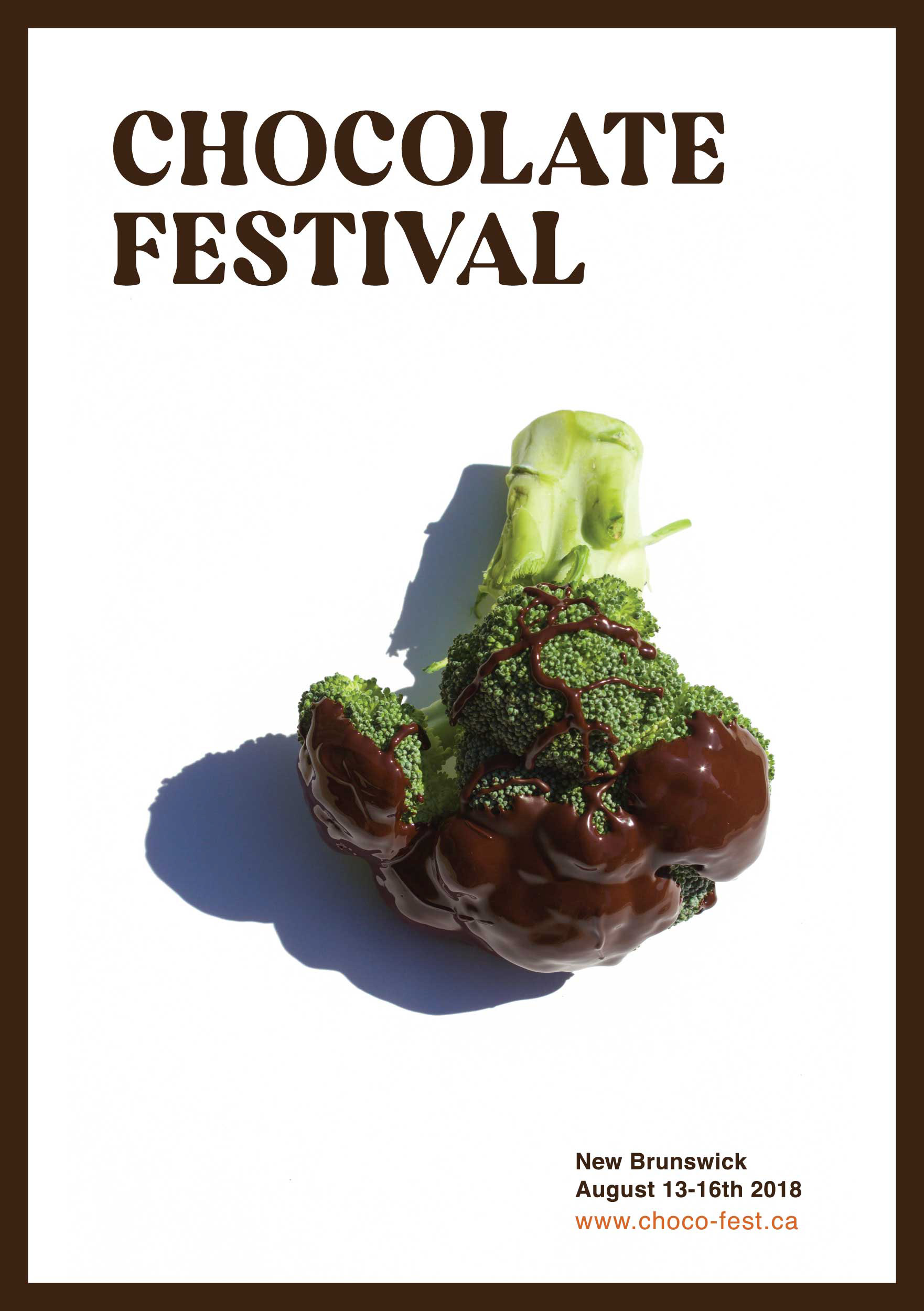
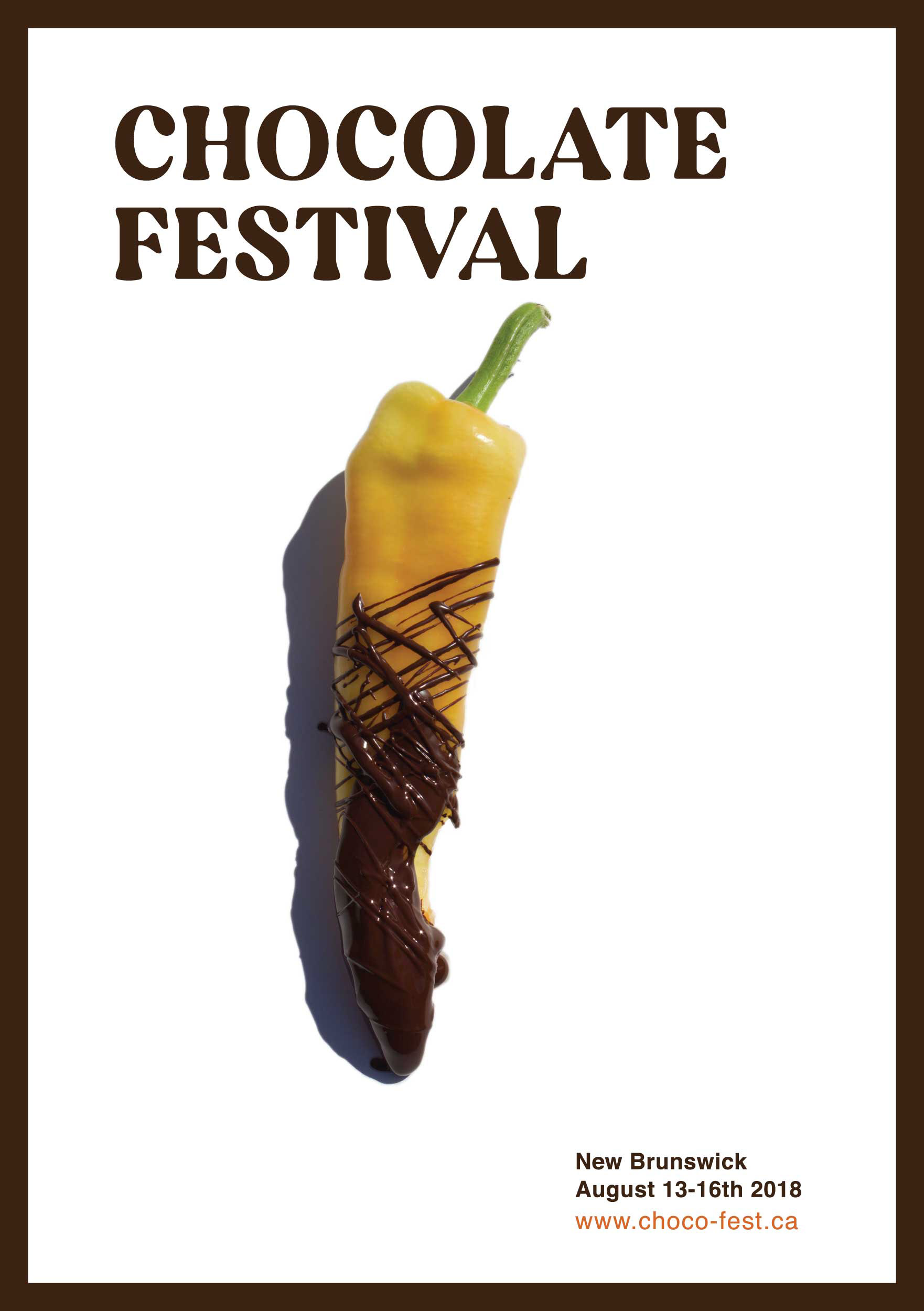
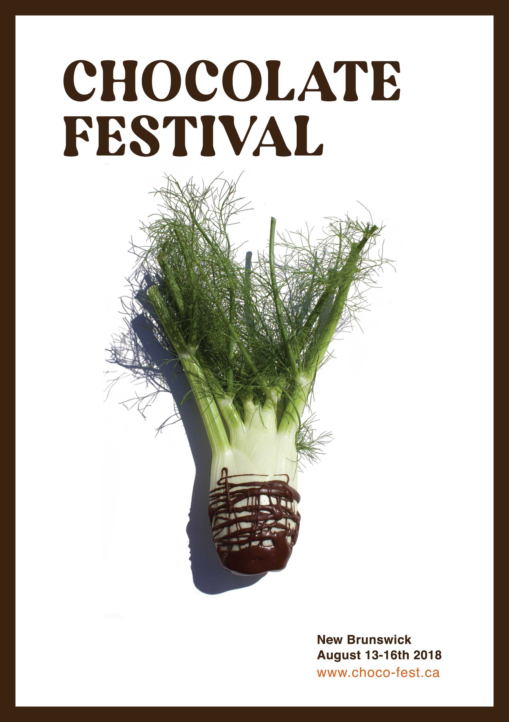
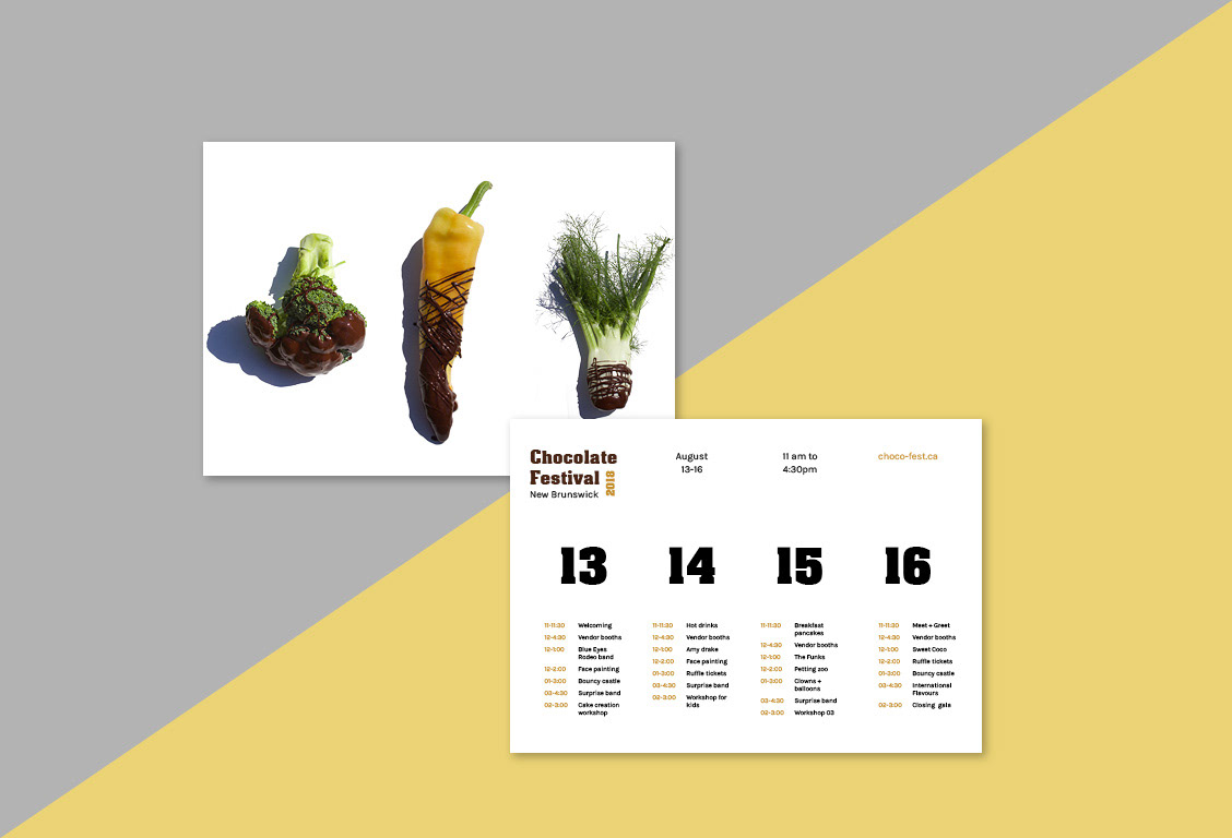
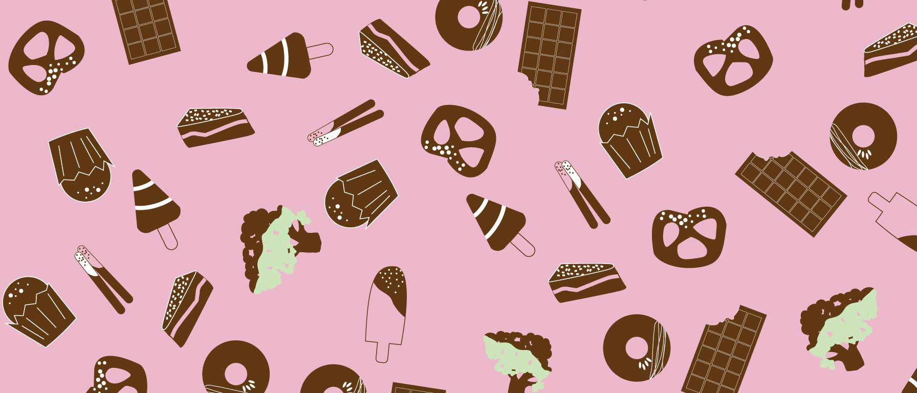
Chocolate Festival
I wanted to create a playful branding campaign that promotes the Chocolate Festival in New Brunswick. I went along with the concept of dipping vegetables in chocolate as a way to attract the viewer's attention. The idea was inspired by how most kids will eat anything that has chocolate in it. I grew up hearing parents say "if you eat your vegetables at dinner time, you can have a treat". This sentence was the inspiration starting point to developing this concept, using humour as a marketing tool.
Branding | Photography | Print design | Graphic design | Typography


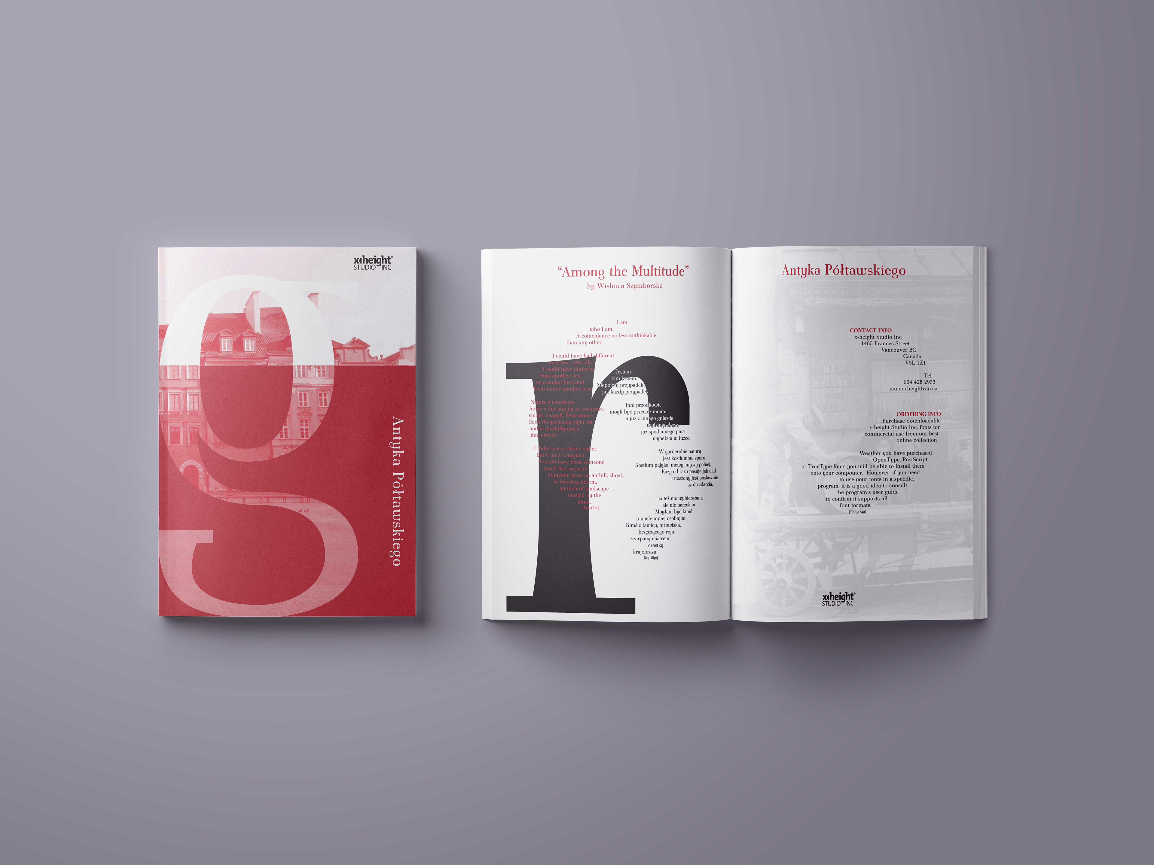
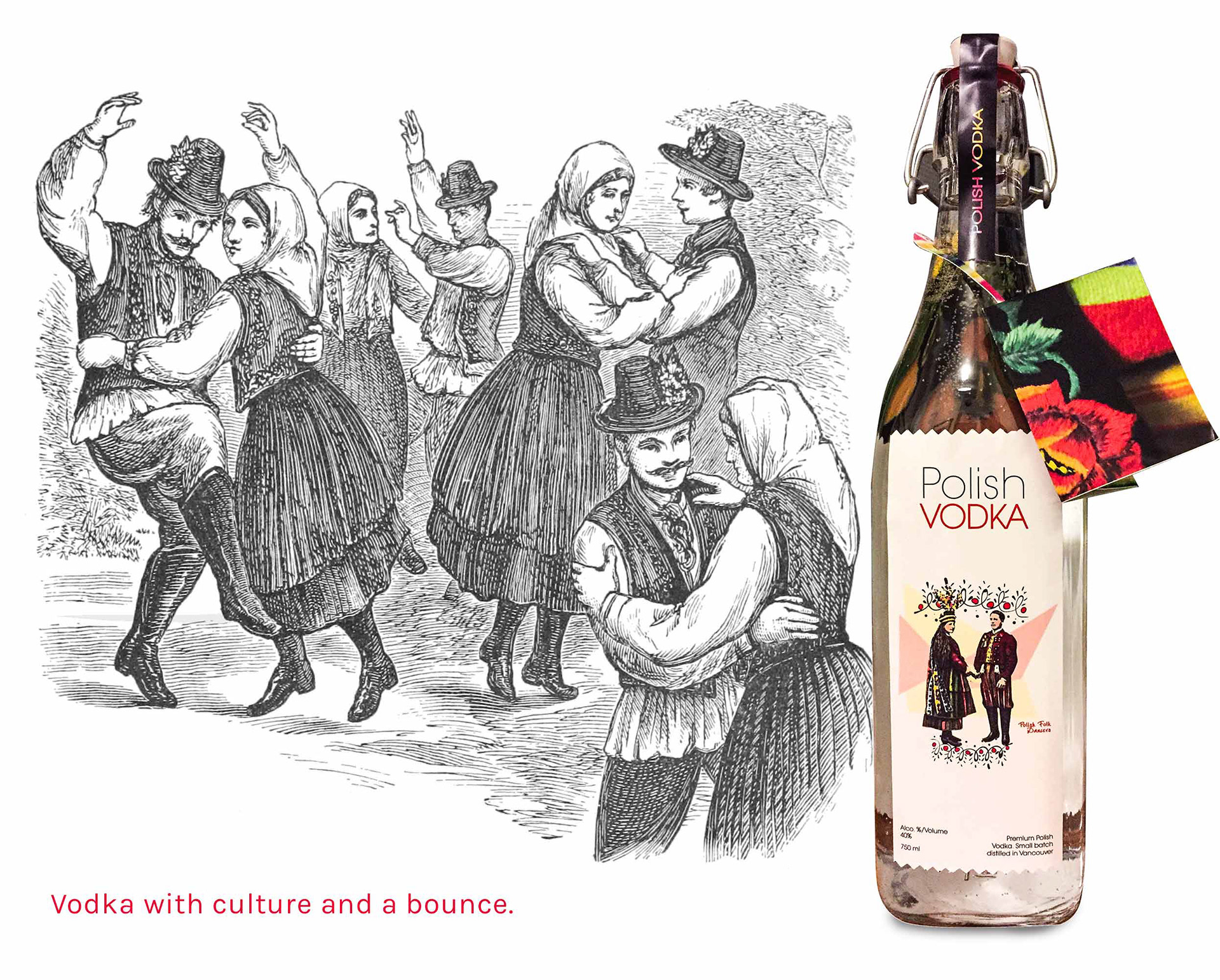
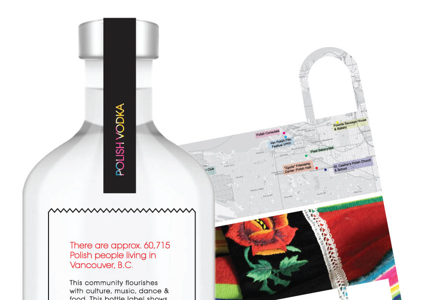
Polish Vodka Label
I decided to embrace my Polish heritage and design vodka labels that celebrate the Polish community in Vancouver BC. After interviewing cultural leaders in the Polish community, I designed three labels that each tell a different story. The label featured below focuses on folk dancers, while the other two tell stories about Polish food and a local church run by Polish nuns. Each vodka bottle comes with a folded map that hangs on the bottle neck. The map exposes some of the Polish "hot spots" worth visiting in Vancouver.
Branding | Photography | Graphic design | Typography | Inverviews

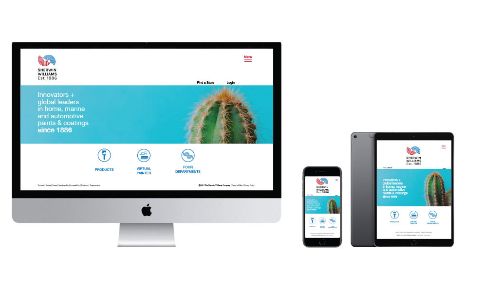
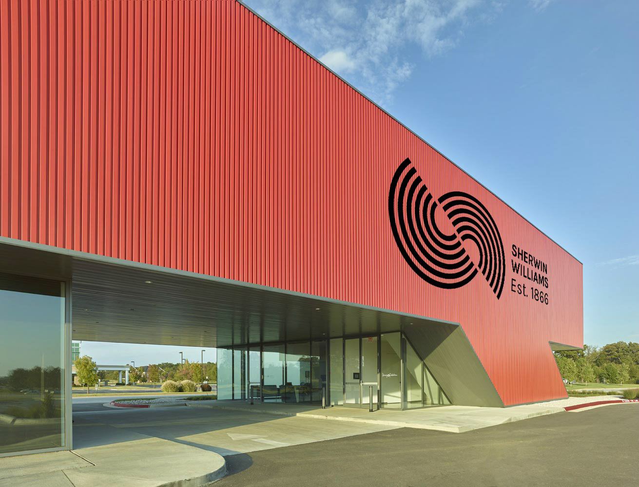
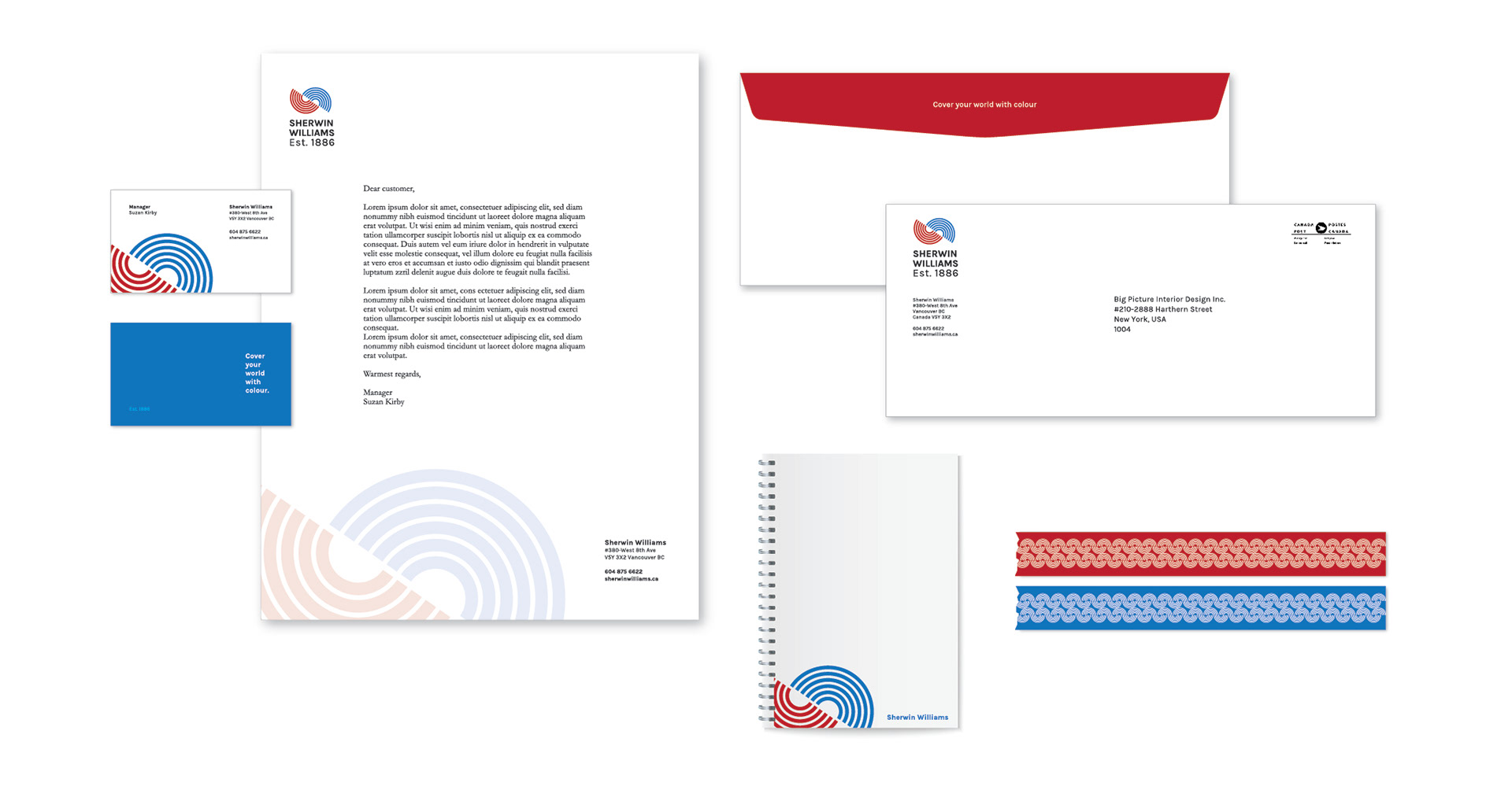
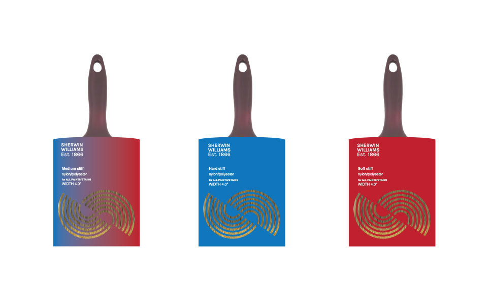
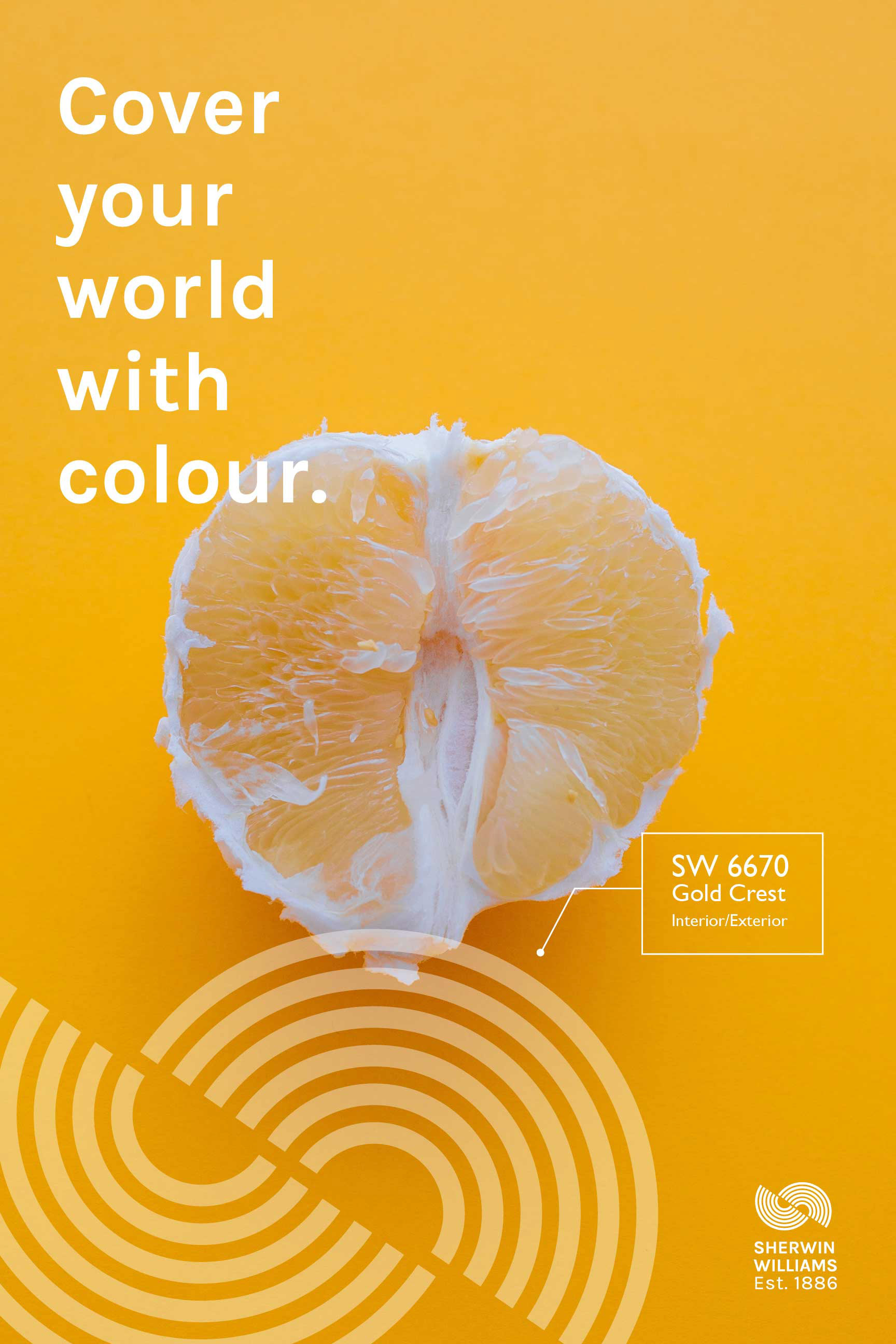
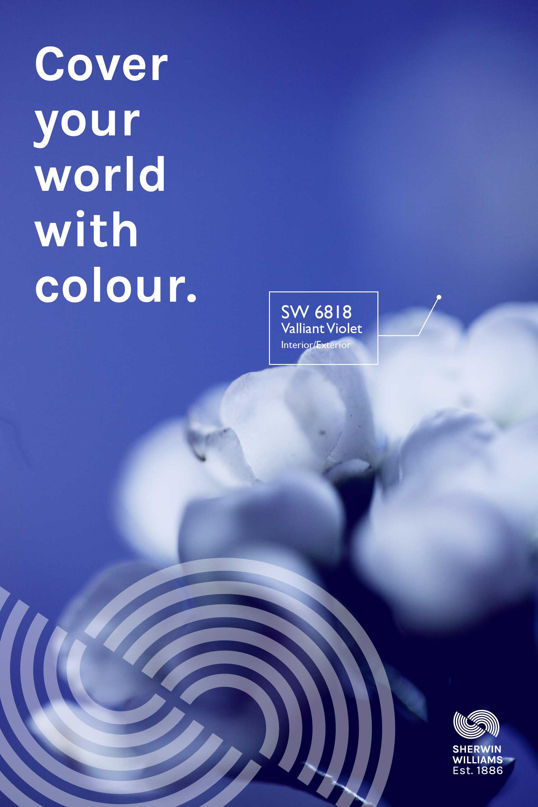
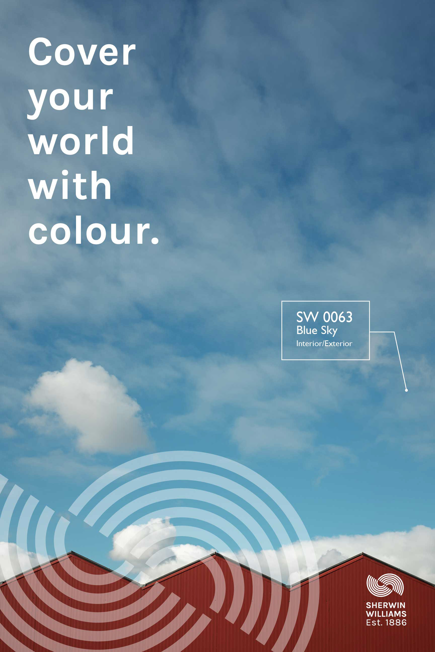
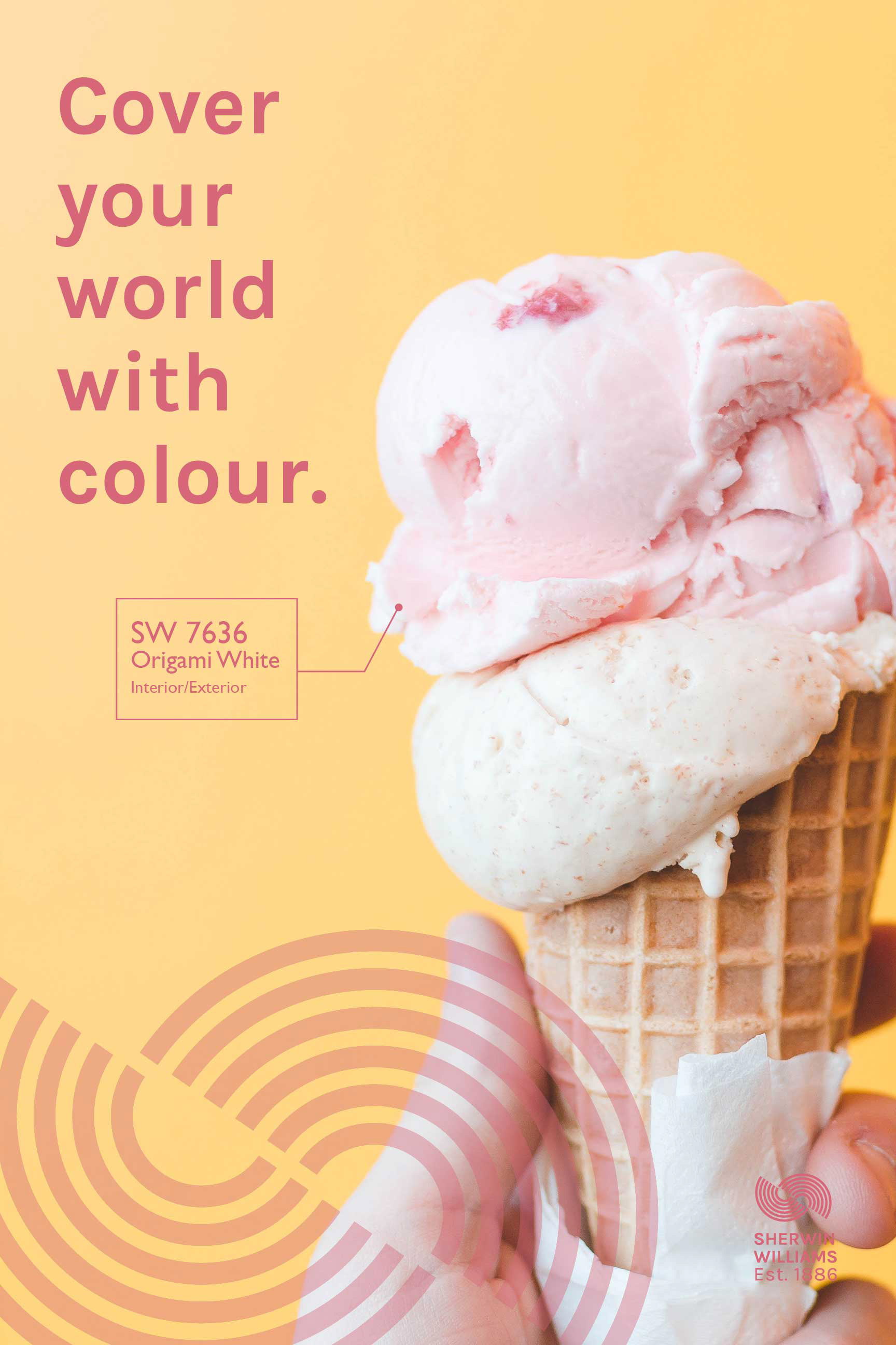
Sherwin Williams Re-Branding
Sherwin Williams paint was first established in 1886. The current logo has not changed since 1886 and, one might argue, it is inappropriate because it appears as if the world is being covered with red blood. My inspiration for the branding language was inspired by the shape of the paint can as well as the 'swirling' affect when paint is mixed. I kept the same blue colour to retain the long history of this global company. The red and blue signifies America where the company was first established. I slightly changed the tag line from "cover the world" to "cover the world with colour".


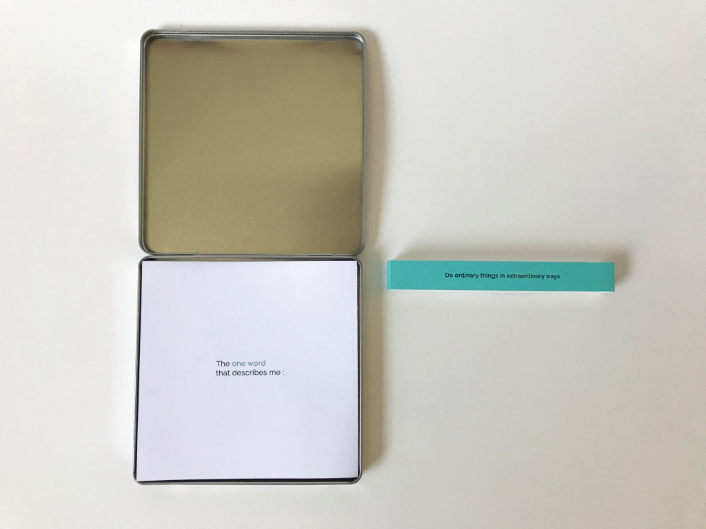
Ktok Studio Promotional Gift
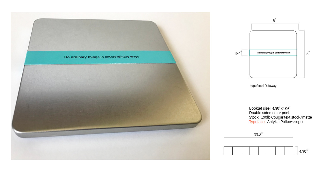
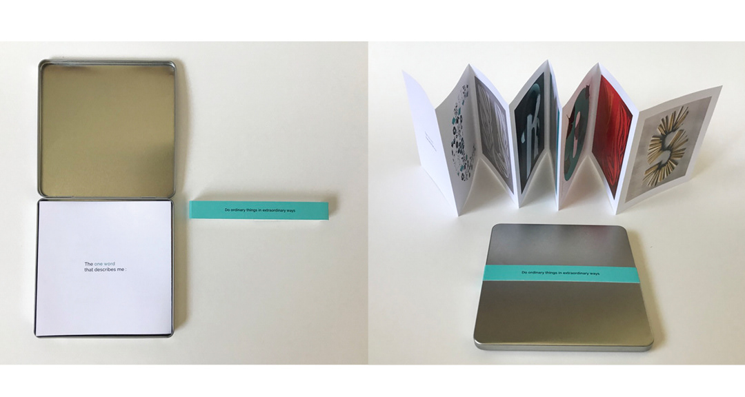
With this self promotional project, I wanted to tell my audience that I am an interdisciplinary designer and all of my design decisions are primarily driven by one word...(being) CURIOUS. Everything except for the square metal container was designed and build by me using various digital, 2D and 3D building techniques. This project showcases my interdisciplinary approach, using graphic design, industrial design and artistic exploration.
Branding | Photography | Graphic design | Typography | Product design | Illustration

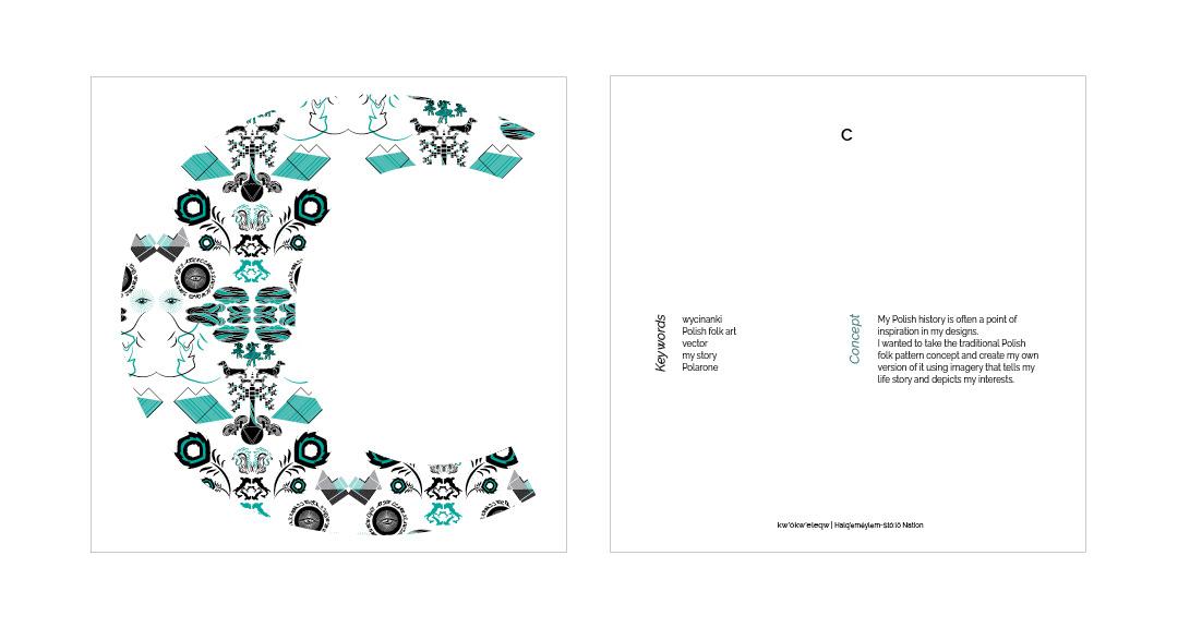


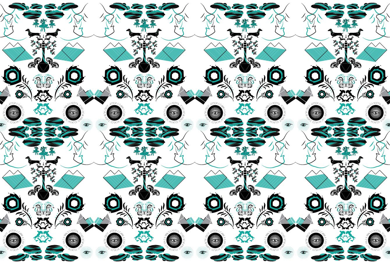
Inspired by traditional "wycianki Polish patterns", I created my own version of Wycinanki that depicts my life story

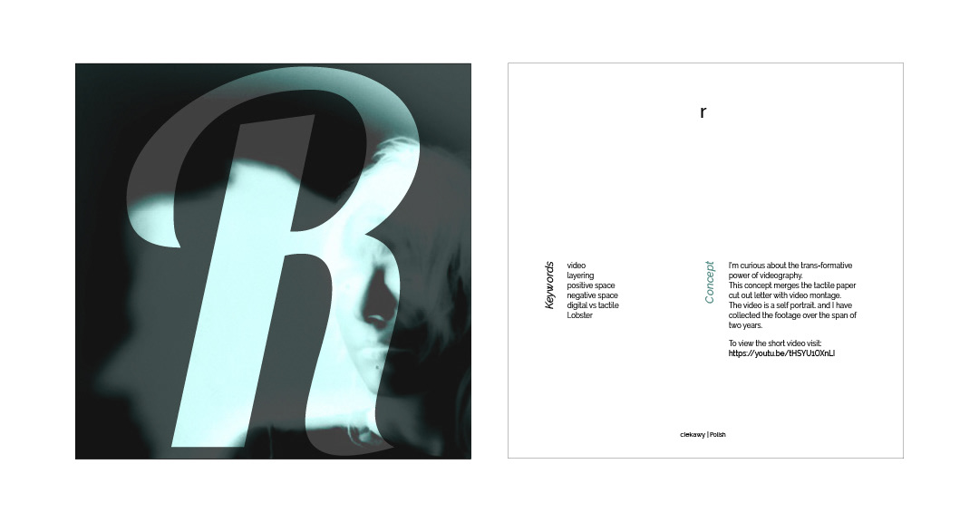
Foam core cut out
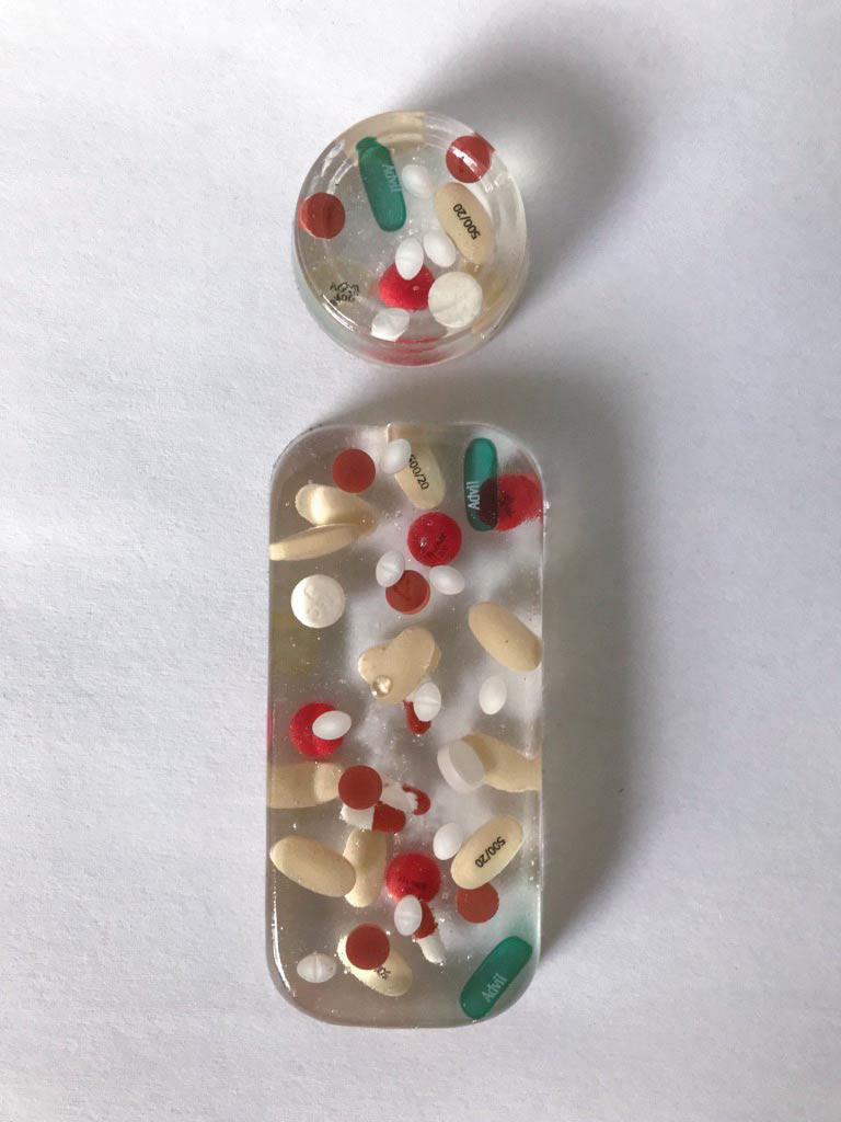
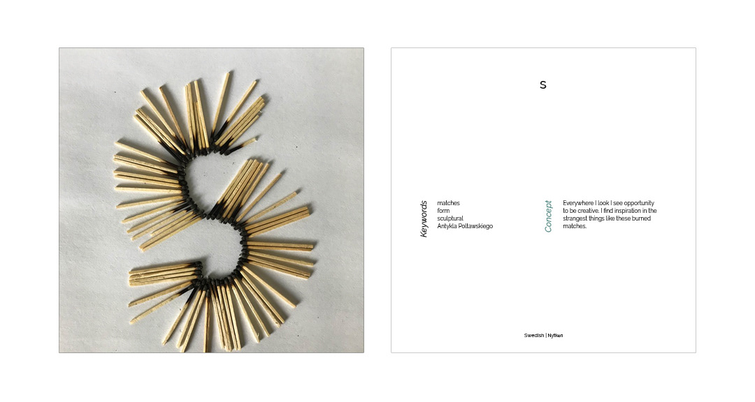
Pain medication cast in resin that resembles my journey of recovery from a car accident

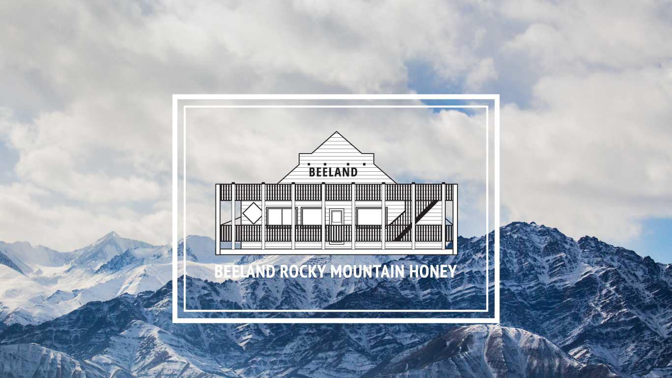
Beeland Market
The owner and founder of Beeland wanted a new logo for his established honey company. He did not want a logo that had the typical visual language related to honey products, like bees, flowers, and honeycombs. He wanted a simple, modern brand. I chose to focus the rebrand on the company's historic wooden trading post building. This building visually stands out because it's in a small town of Spillimacheen (population 7,000) located in the middle of the BC Rocky Mountains. I showcased the beauty of the honey itself by designing clear labels that allow the building and mountain images to be viewed through the glass jar.
Spillimacheen, BC
Branding | Graphic design | Typography | Illustration | Packaging design

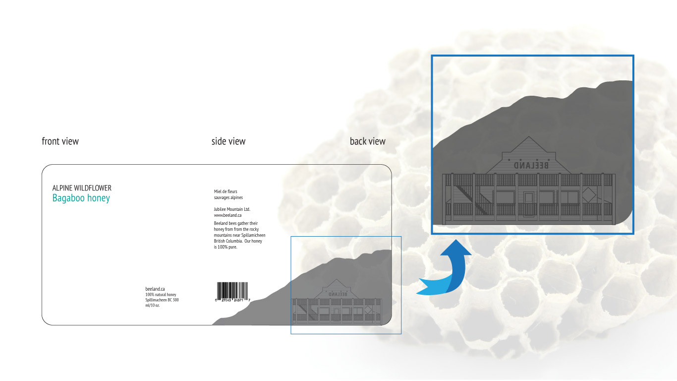
The honey jar label will be printed on clear 3-4 ml vinyl. The beeland and mountain illustration will be reverse printed so that it can be seen through the honey. The honey type and flavour will be printed on the front. There are four honey flavours: Light Gold; Amber; Bagaboo and Snow Berry. Each honey flavour name will have a specific colour association.